I fell down this rabbit hole because of a shoe brand.
There’s a genre of post going around where someone films a beautifully merchandised site and points out how thoughtfully it’s put together. The one that got me was Kurt Geiger’s Matching Shoes & Bags — not a recommendation widget on a product page, but an entire category page. Named collections along the top — Kensington, Southbank, Chelsea — and inside, shoes and bags carrying the same print, the same hardware, the same motif, merchandised into a single grid. The butterfly bag and the butterfly platform heel, a few tiles apart.

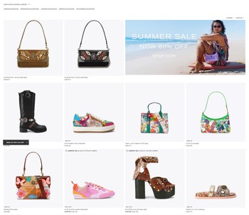
I love those posts. But watching it last week, a small, annoying question stuck in my head and wouldn’t leave: do we actually know this works better here than somewhere else?
We all have a rule of thumb about where cross-sells belong. Some people swear by the product page — show the matching bag right next to the heels, while the shopper is dreaming about the outfit. Others say the cart is where it lands, because that’s where intent is real. A third camp is all-in on the post-purchase, one-click, thank-you-page upsell. Everyone says their spot is the best spot. And when I went looking for the numbers behind those convictions, I found something a little uncomfortable: the data doesn’t agree with any of them cleanly, and most of us have never measured our own.
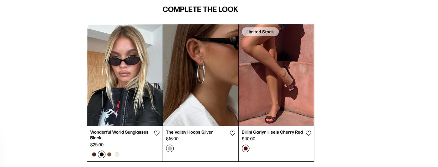
And that’s worth separating out before we go further, because “complete the look” isn’t one thing. Kurt Geiger’s version is a curated category page — the pairings decided in advance most likely by a human merchandiser, then built into a collection. The far more common version is a module bolted onto the product page, generated per product, like this one on Princess Polly:


Sunglasses, hoops, heels, chosen to go with a slip dress. Same idea, completely different machinery: one is a collection somebody built, the other is a widget making a guess. And here’s my first clue about how thin this evidence base is — when I went looking for benchmarks, I found numbers for the widget and essentially nothing for the curated page. The format that started this whole rabbit hole isn’t even one of the placements anybody measures.
Let me walk through what I actually found, because it changed how I think about the whole thing.
The product page quietly wins — per impression
Here’s the first surprise. If you measure by conversion rate — the share of shoppers who see a cross-sell and accept it — the product page tends to come out on top, not the cart or the thank-you page.

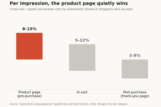
Pre-purchase upsells on the product page convert somewhere around 8–15%. In-cart lands closer to 5–12%. The post-purchase one-click offer, the one everyone’s been evangelising, converts on maybe 3–8% of orders. Ranges wobble by category, but the ordering holds up across the benchmarks I could find.
So the “obvious” answer — put it at the moment of highest intent, at checkout — is, by this metric, the worst of the three. Which made me suspicious, because I know post-purchase upsells make brands real money. And that’s the trap.
But conversion rate is the wrong scoreboard
The reason post-purchase looks weak on conversion rate is that it’s being scored on the wrong thing. A thank-you-page upsell doesn’t need a high accept rate to be worth it, because every yes is pure incremental margin with zero acquisition cost and zero checkout friction. The buyer has already paid; adding one item is a single tap, no card re-entry, no shipping form.
Measured properly, post-purchase one-click upsells lift average order value by around 5.6% on average, and 10–20% when they’re done well. That’s not the same number as “conversion rate,” and comparing the two is apples to oranges. A product-page cross-sell and a post-purchase upsell aren’t competing for the same job. One is helping someone choose while they’re still deciding. The other is adding to a decision that’s already made.
Once I saw it that way, the whole “PDP vs cart vs post-purchase” debate started to feel like arguing about whether a hammer beats a screwdriver. Upsells — trading someone up to a better version — tend to work best before purchase, while they’re still weighing options. Complementary cross-sells — the matching bag, the refill, the accessory — tend to work best at or after checkout, once the core decision is locked. Placement isn’t the strategy. It’s downstream of what kind of offer you’re making.
You can see both jobs running side by side on a single product page. Here’s the upsell — trade up, before you’ve decided:

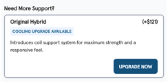
Note what it’s doing. It names the better version, prices the difference plainly, and gives one line of reasoning for why you’d want it. And here, a few hundred pixels below, is the complementary cross-sell — the accessories that only make sense once the mattress decision is made:


Same page. Two completely different jobs.
The lever nobody wants to hear is relevance
Here’s the part that deflated my inner optimiser. When you look at the cases where a cross-sell genuinely moved the needle, the win usually wasn’t about location at all.
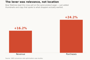
Bear Mattress ran a test on their product-page cross-sell. They didn’t move it to the cart. They didn’t add a post-purchase flow. They kept it in exactly the same spot and just made it better — added thumbnail images and rewrote the copy to speak to what shoppers actually cared about. Revenue from that block went up about 16%, and purchases about 24%.
Same placement. Different relevance. Big lift.
That lines up with the thing we all technically know and mostly ignore: shoppers accept a recommendation when it’s obviously for them. Recommendations tied to what’s actually in the cart beat generic “you may also like” by a few percentage points on their own. The bag has to genuinely go with the shoes. The refill has to be for the thing you bought. When the match is real, placement matters far less than we pretend. When the match is lazy, no placement saves it.
And lazy is easy to spot once you’re looking for it. Here’s the other end of the spectrum — a “you may also like” strip on a running-shoe product page:

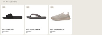
Slides, flip flops, another sneaker. Nothing here completes anything — it’s just more footwear, adjacent in the catalogue rather than adjacent in the shopper’s head. Compare it to the Bear block above, which tells you what the upgrade does and why you’d want it. Both are product-page modules. Only one is actually making an argument.
The quiet problem underneath all of it
So why do we argue about placement so confidently? I think it’s because placement is visible and relevance is work. You can copy a competitor’s PDP layout in an afternoon. Building recommendation logic that’s genuinely tuned to your catalogue and your customer is a longer, less screenshottable project.
And here’s the stat that actually bothered me the most:

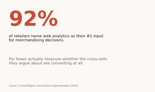
Something like 92% of retailers name web analytics as their number-one input for merchandising decisions. But a striking share of them never actually measure how their own product associations convert. We’re pulling recommendations from data we trust, and then not checking whether the recommendations landed. We have strong opinions about a thing we’re not measuring.
Where I’ve landed (for now)
If I had to compress all of this into something useful: stop treating cross-sell placement as the decision. Decide first whether you’re making an upsell or a complementary cross-sell, because that mostly settles where it goes. Then put your real effort into relevance — cart-aware, catalogue-aware, genuinely-matched recommendations — because that’s the lever with the biggest, most repeatable payoff. And above all, actually instrument the thing so you know your own take rate by placement instead of borrowing someone else’s conviction from a LinkedIn video.
That Kurt Geiger category page probably is the work of a sharp human merchandiser who knows the season and the customer. What I can’t tell — what nobody scrolling past can tell — is whether gathering those coordinated pieces onto a collection page sells more than surfacing the same match on the product page, or in the cart, or on the thank-you page. They might know. Most brands don’t.
So I’ll turn it into the question I actually can’t answer for myself: do you know your cross-sell take rate by placement — or are you, like most of us, just doing what looks right?
Related reading: Cialdini’s principles in modern ecommerce — our series on why shoppers say yes, and complex product types across platforms, on the mechanics behind bundles and grouped products.