Getting customer information such as name, address and contact details is a part of almost any checkout, at least for first time buyers. On the one hand you as a merchant need this information to process the order. On the other hand, providing this information is probably the most time consuming part of checkout process for your customer with high potential to create frictions that lead to checkout abandonment. In this post we discuss five tips how to get customer information right and increase your online store conversion rate.
1. The less is more
Review all the field in your customer details form. Do you really need all the information you asking? It is probably nice to have customer birthday, gender and phone number for marketing reasons, but surprisingly substantial number of customers are not happy to provide such information. So think carefully about asking all such things during checkout. And if you really want to ask this information, follow the next recommendation:
- Explain why. For example if it is about phone number write a micro-copy like “For order delivery” nearby. Or if you ask for birth date, write “To provide you with a special treat”.
- Keep it optional. Don’t make the fields that are not really mandatory mandatory. Think about what is better, do not have a sale at all or have a sale, but don’t know your customer birthday or gender
- Provide a neutral option, like “Prefer do not disclose” for gender. The reason for that is again to keep privacy concerned customers and avoid having fake data, which some people may provide if you insist too much.
The Iconic asks for gender without explanation and neutral option, not the best way
2. Be careful with auto-complete and address look-up tools
In theory using address look-up or auto-complete tools sounds like a very good option for merchants: easier and quicker for customers to fill, less typos, less delivery errors.

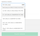
Address finder (ASOS)
The example of semi-automatic address finding tool above is taken from ASOS (Australia) website. While it is good in theory, in practice according tests done by Baymard Institute it confuses 41% of users, who couldn’t get how it works. People expect to see street name, city, postcode etc and when see just one field where they should type the address they are not sure how to proceed. The process isn’t as simple as it looks, for example in many countries address starts from street name, not number. Also these tools rarely work well with browser form auto-complete tools, causing additional frustration. Furthermore, none of the tool available is perfect: some new addresses will be missed due to lag in update and for cautious customers it may cause unnecessary concerns about can the product be delivered. So users try to use the tool, fail to do it, roll back to manual address entry and as a result spend more time and cognitive efforts than required and not surprisingly some of them give up and decrease store conversion rate.
So the bottom line – consider carefully does your business really benefit from such tool and if yes at least provide fall-back option to enter full address manually.
3. Use postcode to detect city and region
It may sound contradicting previous advise, but use of postcode to automatically detect city/suburb and region/state causes minimal confusion and errors, works well in most countries and really saves time user spend typing. It will require to re-arrange the order of the field on your form and have postcode/zipcode just after street address field.

Postcode/city/state look-up, Harvey Norman online store
Example above shows how such feature is build on Harvey Norman website. It’s not bad, but not ideal, there is no option to change postcode, suburb and state manually and separately, which may be required in some cases.
4. Have Billing address equal to Shipping address by default
For most ecommerce websites (excluding some verticals with heavy gifting share like fresh flowers), billing and shipping address are the same for majority of the orders. Therefore you save your customers time by making them equal by default, so they don’t have to type the address twice. Surprisingly many online store don’t do it and opt-in for more complex options like “Copy your shipping address” to billing address used by Apple or just asking customers to type the address twice.

5. Hide address line 2

Second line of address often confuses customers who start to think about is the information they put to the first address line correct and do they need to split it. Some users even start to type there information like city and postcode.
So consider hiding address line 2 behind the link that users have to click to expand this field. It provides your customer with ability to add 2nd line of address when they need it, but reduce the confusion for those who don’t use it.
We’ve just scratched the surface of what can be done in ecommerce checkout optimisation. If you need help with improving your checkout, increasing store conversion rate and reducing cart abandobment – Magenable offers an ultimate checkout UX audit service.


