Part 6 in our series on Robert Cialdini’s principles in modern ecommerce UX. If you missed the earlier parts:
Part 1: Social Proof → Part 2: Authority → Part 3: Scarcity → Part 4: Reciprocity → Part 5: Commitment & Consistency
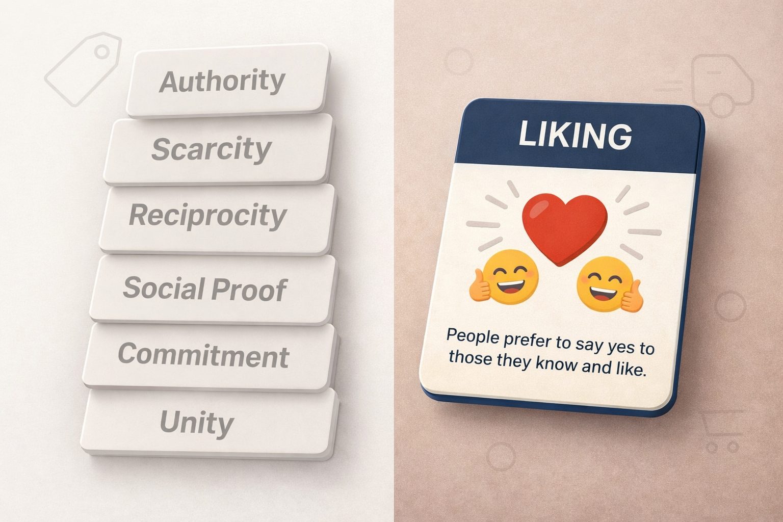
Liking is simple: we’re more likely to say “yes” to people (and brands) we like. In ecommerce, “liking” often shows up before any rational comparison — it’s the feeling that this brand “gets me”, looks good, and carries positive associations.
In Cialdini’s framing, the main drivers are:
- Physical attractiveness
- Similarity
- Compliments
- Conditioning & associations
1) Physical attractiveness
Attractiveness isn’t only “models and photography”. In ecommerce it’s also: lighting, composition, typography, spacing, and how “clean” the overall experience feels. When presentation is strong, customers often assume the product and service will be strong too.
Example: High-quality PDP presentation
![ajeworld-com-au screenshot, physical attractiveness principle illustration]()

Ajeworld.com.au website screenshot: Visual polish makes products feel easier to trust and easier to choose
What to look for:
- Consistent product thumbnails on category pages
- Strong “in use” imagery (not just pack shots)
- Readable typography + calm layout (less cognitive load)
Watch-out: If imagery is too retouched or misleading, you’ll pay for it later in returns and support.
2) Similarity
Similarity is “people like people like them”. Ecommerce applications are often subtle: audience-coded imagery, use-case navigation, and language that matches how customers describe their lives (without trying too hard).
Example: “Shop by edit” / use-case navigation


footy-shorts.com.au website: Similarity via using audience language
Practical patterns:
- “Shop by edit” (Vacation, Evening, Work, etc.)
- “Perfect for…” sections that mirror real scenarios
- Local relevance (AU climate, activities, seasons)
3) Compliments
Compliments work when they feel like recognition of the customer’s taste or decision — not guilt or pressure. In ecommerce, this is often done with short microcopy around add-ons, cart actions, or confirmations.
Example: “You’ve got great taste” style microcopy

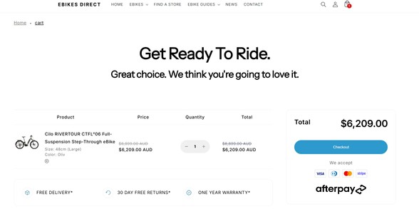
ebikesdirect.com.au website: Light compliments can add warmth and increase positive momentum
Do: “Nice pick”, “Great taste”, “Solid choice”.
Don’t: guilt framing (“Don’t abandon your cart!”) or forced cheerfulness everywhere.
4) Conditioning & associations
Conditioning is learned liking through repeated pairing with positive cues. In ecommerce, the simplest version is pairing products with positive contexts: gifting, celebrations, travel, “starter kits”, curated bundles, or occasions customers already feel good about.
Example: “Gift-ready” bundles and curated collections

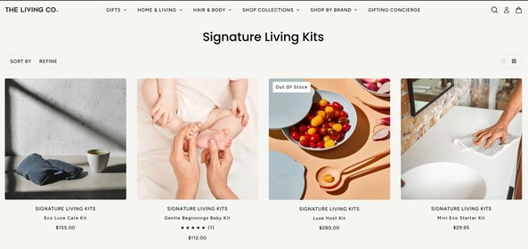
thelivingco.com.au website Pair products with positive contexts customers already value
Common association plays:
- Gift-ready packaging cues
- Bundles framed as an occasion (“Weekend kit”, “New home”, “Travel set”)
- Partnerships that make sense for your audience (be selective)
Watch-out: Random causes/partnerships feel opportunistic. Associations need to fit your customers.
Implementation checklist
- Set a minimum standard for PDP images (angle set + in-use shot).
- Create 3–5 “shop by edit/use-case” collections that mirror customer identity.
- Add 1–2 compliment microcopy moments (not everywhere).
- Build one “occasion” landing page (gift-ready / travel / seasonal bundle).
- Audit whether your visuals match your actual service level (avoid overpromising).
What to measure
- PDP engagement (gallery interactions, time on page)
- Add-to-cart rate on pages with upgraded imagery
- Conversion rate of “shop by edit” landing pages
- Returns rate (to ensure attractiveness isn’t misleading)
Summary
Liking in ecommerce is often built from four levers: attractive presentation, similarity cues, small compliments, and positive associations. Each is simple on its own — the impact comes from consistency and restraint.
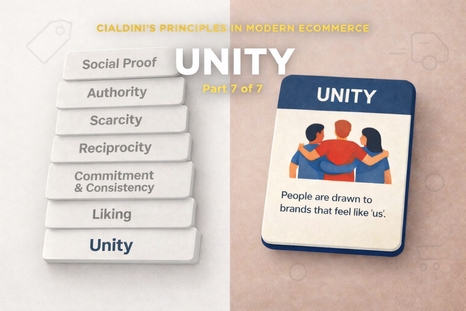
Next: Part 7 — Unity (shared identity and “we-ness”).