According to number of researches (check the references in my previous posts if interested) on-site search is very important tool to convert online store visitors to customers, especially for the stores with extensive inventory. In this article I’ve decided to compare internal site search functionality of three big Australian department stores – David Jones, Myer (both are traditional brick&mortar stores with online presence) and The Iconic (a pure-play online retailer with over $100M of venture capital funding).
Who among these 3 heavyweight retailers has the best on-site search?
On-site search comparison criteria
In this little research I’ve used next criteria for on-site search evaluation:
- Search box design (size, visibility, ease of use)
- Basic search functionality – search by product name and model number
- Work with subject area terminology – jargon and synonyms and abbreviations
- Correct work with special characters like inches (‘)
- Auto-complete and auto-suggest functionality
- Faceted search
- Search results page design, including meaningful breadcrumbs and pre-filled search queries
The set of criteria is established, so let’s start to see how David Jones, Myer and The Iconic websites perform. The tests were conducted using Win 8 laptop and latest Chrome browser as desktop and Google Nexus 5 with default browser as mobile device.
1. Search box design
David Jones
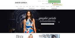
David Jones on-site search box, desktop rendering. Click to the image to enlarge
Search box size in my opinion is quite small and has not highlighted by any visual cues, so you can find it, but need to apply some cognitive efforts. The placement of the search box is consistent across all pages, which is good. The size of the search box isn’t enough to accommodate long descriptive queries without hiding part of it. Our tests shows that it was enough to display 25 characters (it probably depends on character width), but definitely part of longer search query like “Ermenegildo Zegna yellow dress short” will be hidden.
Mobile version of search box is different, it is hidden behind the looking glass icon. Once you click to the icon, the search box appears underneath. The placement is consistent across the whole website similar with desktop version.
Our score for search box design on David Jones online store is 3.5 out of 5.
Myer
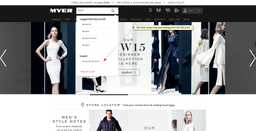
Search box is placed quite prominently on Myer website, right from company logo. It is just slightly bigger than one on David Jones, but due to better placement and more contrast colours is easier to locate. Myer uses quite big font, so the number of letters you can type into the search field without scrolling is in fact a bit less than David Jones’ search box (23 characters).
Mobile search box is visible without need to further actions on Myer.com.au and consistent through all mobile website. Note that Myer has a separate version of website for mobile, hosted on m.myer.com.au
Our score for search box on Myer online store is 4 out of 5.
The Iconic
The Iconic on-site search box, desktop rendering. Click to the image to enlarge
On-site search box on The Iconic is the biggest among all 3 websites I reviewed and has prominent enough positioning in the middle of the top navigation menu. Iconic’s designers have found interesting solution to let users type longer queries without scrolling – once you click to the search box area it expands to virtually all page width, so users will not have issues with pretty long keywords.
Iconic employs responsive approach to the design, so mobile version of search box looks very similar with desktop one, with one exclusion – search box (similar with David Jones) is hidden behind the looking glass icon. Once the icon is clicked it expands to the page width.
The Iconic has the best search box design among all three websites, but there is still place for improvements. Our score is 4.5 out of 5.
The winner (of this part of comparison) is The Iconic
2. Basic search
In this test we’ll try to make few simple searches and see how our contestants handle it.
David Jones
To test basic search we’ve tried the next search queries:
- Search by model name. We’ve used “Diesel L-Heiko-2 Leather Jacket” since there is such product listed at David Jones website. The search worked, moreover, we’ve been forwarded directly to the product page bypassing search result page. Apparently there was only one product meeting our search criteria. So good job here, one less click!
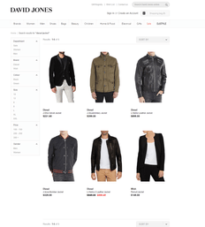
- More generic search. Next we’ve tried to use more generic keyword – “Diesel Jackets”. Here the results were not so good. As you see on the screenshot below, aside of Diesel’s jackets correctly listed, for some reason one women jacket from another brand was displayed there.
- Next we’ve tried to use long part of product description in the search, namely “bold leather jacket accented with high-shine hardware”. That search doesn’t return any result, maybe there is some limitations on the length of search term used.
Our score for simple search at David Jones online store is 4 out of 5.
Myer
Here I used similar scenario, but with a different product
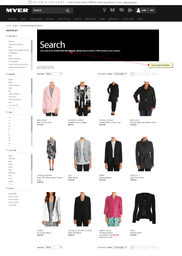
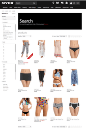
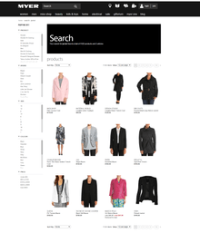
- Simple search for “HUSKI Bolt Herringbone Jacket” (which is full product name) returned quite unexpected results. As you see there on the screenshot below, there are over 1000 search results listed and all we see on the 1st page is very far from what we have tried to find. So a poor guy looked for this particular jacket would probably decided that Myer doesn’t stock it and walk away
- Broader search term “HUSKI jacket” returns not better results with similar 1,000 + matches and women products listed on top
- We’ve tried to search for other products, namely “BASQUE Zip Detail Work Jacket” and “BAKER BY TED BAKER Tb Cuffed Chino Short” and here the results were much better – right products was listed 1st, while there were still thousands of matches
- Search by model number (TTBS15021) worked fine and forwarded us directly to product page
- Also it is possible to search for words in product descriptions, if the word is unique enough it may be helpful
So seems that simple search work isn’t stable and provide reliable results across all SKUs at Myer website, something that I would suggest to fix urgently. Our score to Myer here is 3 out of 5.
The Iconic
Here as a product for test I selected this Hugo Boss jacket.
- Surprise again – search by product name “hugo boss otails jacket” hasn’t returned any result!
- Broader search “hugo boss jacket” wasn’t successful either – no matches.
- Finally I had found it when searched for “Hugo Boss Orange Jacket”. So the product is indexed by search engine, but type of match is set in very strict way and it damages usefulness of search significantly. I would hardly imagine that many customer know exactly what kind of colour The Iconic used in the product description even if they know one they prefer.
- To be fair to The Iconic, after additional experiments, I’ve found that the search returns valid result (as on the screenshot above) for “Otails Jacket” and “Hugo Boss Orange Otails Jacket”. Anyway, that matching settings look weird for me and definitely require further tuning, at least if the site owner needs business from consumer who use search
- On a positive side The Iconic search engine checks product description, I’ve managed to locate the jacket searching for “soft cotton blend and features two internal foldaway straps” (part of the description text) and it was listed 1st.
- It is also possible to search by SKU number, so if you know one you’ll see only this product in the search results. A logical step would be to forward users to the product page directly, which isn’t done.
So our score to The Iconic in this band is 3 out of 5.
The winner (of this part of comparison) is David Jones
3. Smart work with terminology, jargon and abbreviations
Different people use different words to describe the same object. For example same clothes can be called “raincoat”, “overcoat” and “trench coat”. There are probably subtle differences, but at least these words refer to pretty close kind of products. Simpler example may be “trousers” and “pants”.
It may be not so common in apparel, but sometimes people also use abbreviations and slang. Carefully tuned search engine should recognise them and match with appropriate pages. Let’s see how our three retailers succeed in this endeavour.
David Jones
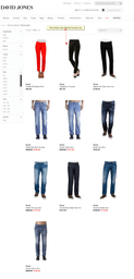
- I’ve started from searching for “Diesel pants” and “Diesel trousers”. The results were very different: in the 1st case I’ve got list of 10 products, the search for trousers forwarded me to one specific page. This “trousers” page was in the results for “pants”
It looks like term “pants” has configured in special way (probably as a product category, or sub-category), while “trousers” search results were displayed only because it was part of product name (“Diesel P-Malphas-A Trousers”)
- Further tests (zero results for “overcoat”, very different results for “tie” and “necktie”) show that very likely there is no work with synonyms done at David Jones online store yet
- Search engine of David Jones store doesn’t understand Australian slang well: search for “Stubbies” returns no results, search for “Bathers” gave me some, but for from what you expect to see in huge department store (just 8 products), “Strides” shows me just few toys with this word in description, not trousers
- Some, probably most popular synonyms may be established however, search results for “notebooks” and “laptops” among other products contain same 9 computers
- Talking about abbreviations, quick test using “UV protection” and “ultra violet protection” shows that there is no mechanism established to set these terms as synonyms
Overall seems that there was very little job done at David Jones website to handle synonyms, jargon and abbreviation, most positive results are achieved due to inclusions in the text (product name, description), not kind of special treatment.
So our score for David Jones will be 1 out of 5 here.
Myer
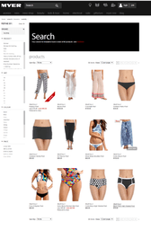
- Search for “pants” and “trousers” provides the same results, so clearly Myer established special treatment of them as synonyms, good job here. The results are consistent site-wide and with additional parameter (brand name – Seafolly was used on the example below)
- “Tie”/”Necktie” and “overcoat” searches show however that may synonyms haven’t been configured yet
- Situation with slang words better than at David Jones: while there are no relevant results for “Stubbies” and “Strides”, search for “bathers” returns plenty of relevant products and Myer understand search for “sunnies” correctly
- Search for “notebooks” and “laptops” return different results (filtered for over $500 products to exclude paper notebooks) however, for some reason devices from Apple are listed only as “laptops”, but not as “notebooks”
- Abbreviation test shows mixed results – there are 624 products listed for”UV protection” and 1009 for “ultra violet protection”, so UV looks like sub-set of “ultra-violet”
In overall the result is very far from being perfect, but shows that some work is done by Myer team here, so our score is 3 out of 5.
The Iconic
- “pants” and “trousers” are clearly configured as synonyms – both search terms shows identical number of search results and even 1st products listed looks to be the same
- Search results for “Overcoat” and “tie”/”necktie” same with peers – these terms are not configured
- Same with Myers, The Iconic knows what is “bathers”, but doesn’t what is “stubbies” and “strides”. It also doesn’t recognise “sunnies” properly (there are some sunglasses displayed, but probably only because the term is used in product name or description)
- Again, similar with Myer there are more search results for “ultra-violet protection” than for “UV protection”, so understanding of abbreviation can be considered poor
Overall score for work with synonyms, slang and abbreviations is 2 out of 5 for The Iconic.
The winner (of this part of comparison) is Myer
4. Special characters
Use of quotes, apostrophes and other special characters often cause error at poorly built on-site search. Good search engines should process these symbols correctly and understand that ” (double quote) means ‘inch”, for example.
David Jones
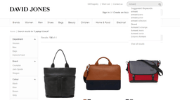
- The test was passed, search for “Laptop 15″” returns relevant results with bags and laptops.
- Search for “Laptop 15 inch” however returned only 4 laptop bags, but no actual computers, so DJ search engine isn’t configured to treat double quote and “inch” as the same term.
David Jones score – 3 out of 5.
Myer
- Myer also passed the test, search results for “Laptop 15″” are relevant
- Same relevant results for “Laptop 15 inches”.
Myer score – 5 out of 5
The Iconic
- Since The Iconic doesn’t sell laptop I had to find something different for test. I’ve tried “16” collar” and the test was passed
- Search for “16 inch collar” produced the same results, so work with quotes/inches looks to be configured properly
Iconic score – 5 out of 5.
The winners (of this part of comparison) are Myer and The Iconic (tie)
5. Auto-completion and auto-suggestion
Auto-completion and auto-suggestion are important tool to guide website visitors through search and as a result increase chances of finding relevant pages and ultimately online store conversion.
David Jones
- DJ website auto-completion suggests both keywords and brands. There is however little visual distinction between sections, it can be designed better
- Suggestions start to appear after 2 letters typed and the speed of work is fine. It also recognises typed keyword not only in the beginning, but also in the middle of key term (you’ll get for example “Emporio Armani” among suggested brands if you start to type “Armani”). Such keyword-in-the-middle suggestions though appear with visible delay, after keyword-at-the-start ones
- The search however doesn’t suggest spelling error correction, for example when I started to type “Hugo Buss” it wasn’t corrected and I was suggested a term based on my past search history. After I follower the suggestion and searched for “Hugo Buss jackets”, the page with no search result appeared, so that previous search suggestion tool isn’t very intelligent
David Jones scores 3 out of 5 in this section.
Myer
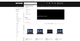
- Myer auto-completion has design with more distinct sections, but I thought that there are only 2 of them: suggested keywords and history, no separate section for brands (it wasn’t completely right as I discovered later)
- Auto-completion works quite weird. It start to suggest terms after 2nd letter typed. Initially I thought that it only recognise search terms that starts from what you are typing. For example I didn’t see not see “Hugo Boss” typing “Boss”. However when I started to type “De P”, I’ve got a different result: a brand with key term in the middle appear and it was displayed in separate brand section
- So I suspect that technically the engine employed buy Myer support separate section for brands and auto-suggestion from not only 1st word, but it hasn’t been configured properly
- No error correction, if you made a mistake in typing even in one letter (like “Hugo Buss”) – it is your own problem
- Myer search suggestion tool also have a separate section for categories that appear if what you type in matches with category name
Due to inconsistent work our evaluation of Myer search in this section is 2 out of 5.
The Iconic
- Iconic search completion has no separation to sections like Brand or History
- It starts to suggest after 2nd letter entered and does recognise search term in the middle (like “Boss” in “Hugo Boss”)
- No error corrections, you have to know spelling to find something
The Iconic’s score for auto-completion and auto-suggestion is 2.5 out of 5
The winner of this section is David Jones
6. Faceted search
Not surprisingly that all three websites have faceted search, nowadays it is an industry standard. Let’s compare how good are they and is there any difference. The lose testing scenario will be a man looking for say a jacket for coming fall season.
David Jones
- The filters used for faced search at David Jones website include: department, price range, size, colour, designer (Australian or International), size, gender and age
- Filtering works quite fast, the time to re-render results after changes is minimal (couple seconds)
- Some of filters look sub-optimal for me. It doesn’t make much sense to have gender filter if there are gender-based top level categories used, like “Men”and “Women”. Probably it makes sense to leave just one parameter to make selection simpler
- Also Age selector is probably relevant only if you search for children products and combined with “girls” and “boys” in gender filter again looks like over-complication
- On the other hand certain important parameters like material are not included in the filters
- Size filter looks barely useful, at least before you dig to individual brand level because there are bunch of different scales used
- You can’t set several filters at once, need to refine your search step by step, which is annoying if you know your selection criteria well
- Once you start to select filtering parameters there is no way to clear all of them easily and return to original search, you need to remove them one by one
Overall impression – it works, but can be done much better.
DJ score for this part is 3 out of 5.
Myer
- Myer’s faceted search contains less filters – Product, brand, size, colour, price
- Nevertheless, two of them are not easy to use – Product looks pretty messy (there are some hard to understand categories like “Take further 40% off …”) and size is hard to use as well due to the same reason with DJ website – different size charts used by different brands
- Once you start to do filtering some choices become unavailable, but instead of hiding them Myer displays that choices in light grey, which in my opinion just produces confusion
- Search quality is questionable, for example I’ve noticed shirts, shoes and pants when searched for jacket
- You can clear all filters by one click, which is good
- Same with DJ – no possibility to filter by material/fabric
Overall impression – half cooked, the score is 2.5 out of 5.
7. The Iconic
- Iconic faceted search has Gender, Sub-category, Price, Size, Brand, Colour and Delivery filters. The filters can be expanded and collapsed, by default Brands and Gender filters are expanded. Due to long list of brands and no internal scrolling, filters occupy sizeable screen area.
- There is a possibility to clear all filters in one click. It works a bit weird however – in reality it seems to clear only Price, Colour, Size and Brand. You can’t clear for example Gender once you selected it, so if you wont to shop for yourself and another person of different gender – you have to reboot your search
- The Iconic has a useful possibility to select more than one value in filters, so for example you can check all jackets of several brand you prefer. This isn’t possible in Myer and David Jones online stores
Overall impression that faceted search at The Iconic is quite well thought, while there is area for improvements. The score for this component for The Iconic is 4 out of 5.
The winner of faceted search section is The Iconic
Search results page design
Good search page is one of the most essential elements of on-site search. Not all users may actively use faceted search or auto-suggestions, but all people who use your on-site search end at search results page. Therefore it is critical to design it right.
Our list of important elements of search results page (aside of faceted search that was reviewed above):
- search term displayed and highlighted, preferably with possibility to pre-fill it
- total number of matching results displayed
- meaningful and clickable breadcrumbs
- flexible sorting
- paging for big number of results
- options to change display settings (number of products to show per page, grid/list view)
- Smart page for the cases when there is no matching results
David Jones
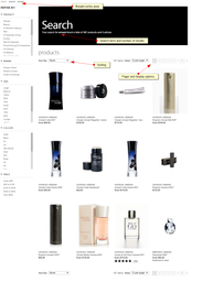
- David Jones has quite solid search results page design covering most of the point I consider important – search term displayed, pager, sorting, number of search results, possibility to tweak display settings. Moreover, most elements are repeated at the bottom, so users don’t have to return to the top to manage search results
- Breadcrumbs start to appear when you use faceted search filters
- Only major thing missed is pre-filled search queries – possibility to re-use (to expand or modify) search query that you just executed. It is especially handy for mobile users, who has to use screen keyboard, so retyping long search term is not easy task for them
- Search result page for the cases when no result found is quite simple
- The suggestions are generic and similar for any search, David Jones doesn’t try to go extra mile and offer you some sensible replacement, at least with the terms I used
Overall score for David Jones in search results page design – 4 out of 5
Myer
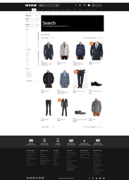
- Myer’s search results page ticks most check boxes – search term, number of results, pager, sorting, display options, breadcrumb
- Same with David Jones – no pre-filled search terms
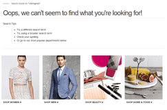
- Page for the cases when nothing found is even more laconic than David Jones’ one
Overall score for Myer in this section in pair with David Jones – 4 out of 5.
The Iconic
- While search results page of The Iconic technically contains all critical elements my overall impression of it is not so good: the placement of elements isn’t very logical and the page looks not very well organised. More specifically – below
- Search term and number of results found are pretty far from each other, so the connection is lost somewhere
- The element that allows to control number of search results displayed per page has not obvious placement (near total number of results) and title. My initial though was that it shows the position of current page, not number of product per page
- Pager doesn’t allow you to go to the last page, only next 5 pages available, which is an issue for big number of results like in our example
- Breadcrumbs are mixed with faceted search filters – some parameters are included in breadcrumbs, some only displayed in filters, not easy to understand from user point of view
- Similar with DJ and Myer – no possibility to pre-fill search terms from search results page
- The Iconic made an extra step with search results page when nothing found – in addition to common list of categories in a few seconds after page load they display best sellers. Not really customised approach, but better than nothing
Overall score for search results page of The Iconic is 3.5 out of 5.
The winners for this section are David Jones and Myer (tie)
Final results
Let’s calculate overall results of our little comparison. We’ll use simple sum of individual band results, so the weight are equal across the board.

Overall results table
The result is a bit surprising for me – I expected that as a pure-play online retailer The Iconic will outperform Myer and DJ with much bigger margin. In spite of lagging in current overall score, David Jones websites has the best basic search quality. Fixing special chars may be comparatively easy win, so with some efforts DJ can improve significantly and catch-up with competitors.
Myer has pretty good overall score, improving basic search and faceted search should provide this retailer a solid boost.
All websites doesn’t do very well with synonyms, abbreviations and slang words and this is understandable, it’s rather advanced area. I was however surprised that such foundation stuff as basic search doesn’t perform well enough at Myer and especially at The Iconic.
Disclaimer: I used my best judgement in evaluation, but admit that at certain extent the results may be considered subjective, so you are welcome to do your own calculations and share what you’ve got with me


