eCommerce is probably the fastest growing sector of retail. According last NAB report, in Australia, eCommerce grew 1.5% on month-to-month basis in April 2015 versus just 0.5% in traditional retail. To harness this growth businesses invest more and more money in their online stores. Unfortunately, even big businesses make mistakes in their store design and functionality that reduce returns. These are roadblocks to conversion.
In this article, I describe the seven deadly sins of such sins and reference the Ausssie retailers who are guilty of making them.
Sin #1 – non-informative shopping cart
Shopping cart should contain detailed information about the product, so customers can be sure that they have added the product they really wants to purchase.
Good shopping cart contains:
- Product image
- Product description (not full, but more than just very short product name)
- Clickable link to product page
- Confirmation that the product is in stock
- Shipping cost estimation or calculator. If you have free delivery you need to make it clear here
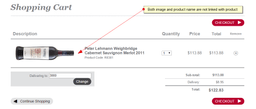
At the Myer Wine Club store you can’t click to product name or image to get more detailed information about the wine you put into the cart. It doesn’t have functionality to enter promo-code as well.
Sin #2. Promo-code done wrong
Promo-codes are often used in online retail to attract new customers or re-activate dormant customers. It is important to make promo-codes right: there should be fine balance: too prominent and open promo-code field may distract your customers and lead them out of your website to find this promo-code. So they leave your online store in search for promo code; the journey from which some of them never return to finalise a purchase.
Correctly executed promo code should be easy enough to locate, but not to bright and accented to reduce number of customers who will leave your store to find it. Good idea is not to activate a promo code field, unless it is clicked by the user thus making it easier to skip.
If you have an open for all initiative that has promo-code in reward (like refer your friend or like us on Facebook) – it probably makes sense to post a link to the page that explains this near the promo-code activation area. On the other hand, if you hide your promo-code redemption too far (like to the very end of checkout process), customers who have promo code and want to use it may just give up and leave the store before reaching this page.
Here are couple examples of promo code realisations done by two big Australian retailers:
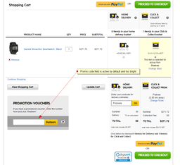
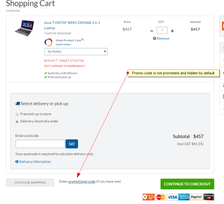
Promo code at Dick Smith website
On Dick Smith website promo-code is too prominent and active by default.
Screenshot from Harvey Norman website below represents better way to present promo code
Promo code at Harvey Norman website
Sin #3. Shopping cart content is not stored well
It is important to keep shopping cart content stored form a user experience point of view. It is extremely frustrating for customers when, for different reasons (computer crash, battery died, Internet connection lost, dinner break etc) have to interrupt the purchasing process and on the return find that they need to start from scratch.
From the websites that I visited, both Dick Smith and Supercheap Auto, seemed to be guilty of this, as after around a 2 hr break my shopping cart content was gone.
BTW, in Magento eCommerce that problem can be solved by enabling Persistent Shopping Cart, which works even for not logged in users.
Sin #4. No guest checkout
It is natural that retailers want customers to register. However from the customer prospective registration may be a cumbersome process and in some cases, especially if consumer wants just to purchase one time.
It isn’t enough just have guest checkout, the option should be prominent enough, so shoppers can find it without a problem. Screenshot below from Woolworth websites illustrate a case of this sin, when no guest checkout available (or at least I couldn’t find it), you have to register to shop.

Woolworth. No guest checkout
Sin #5. Registration is separated from first purchase
We’ve touched guest purchase in the previous section. What happens after the 1st guest purchase?.
Retailers naturally want to keep the customer on board, so it is very important to allow them to either register automatically during guest purchase or make it very easy to reuse all the entered details. A smart way to do it can be offer some incentive for completion of registration (loyalty points, next purchase discount etc). If a customer has to re-fill all that information that she already provided during first purchase, the probability of completing the registration or a repeat purchase is much lower.
Sin #6. Using of a separate login
Some retailers still ask customers to create a login name. With abundance of online services people nowadays relate another login to your online store as just another blocker – if a customer forgets their login details, they can’t login to the website and at best spend additional time recovering their details. There is a good chance that they will give up and go elsewhere, so all your efforts and expense to get acquire the customer is wasted.
It is also important to call a spade, a spade: don’t call the login field “Login”, call it “Your email”.
Sin #7. Charging surprises
If order total value depends on selected payment or shipping method – warn your customer in advance, it is very frustrating to find out this surcharge information at the very end stage of payment confirmation when you entered say all of your Dinner Club or AMEX card details and see that additional 2% surcharge is applied.

Myer delivery options, free pick-up in store
Same principle works in opposite direction: if you giving a discount for certain payment methods show this information in advance. At screenshot above it is done correctly, Myer states that click&collect is free.


