Bettering sales on your Ecommerce site is all about small changes that improve the user experience. As your peak selling period draws closer here are some wins that will better your conversion rate.
Invest in Quality Product Images
One that we come across quite often with our clients is product photos. Users will make decisions based on the image you publish so don’t skimp on quality here.
Your product photos should not be taken on an iphone, if you cannot source them from your wholesaler then you need to hire a professional. The images on the product page should also to be zoomable.
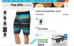
The example below is from the Surf Stich website. Even for a simple product like board shorts, the photos allow the users to peruse every detail and every angle.
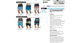
Further down the page you can see that there is also clear copy about the product, its size options and features as well as a description of the brand. This helps the customer be reassured that they are getting the right product as well as giving your site a boost on organic listings.
Make sure you have great search functionality
Users will purchase on your site if you can help them locate the right item, color or size. Infact, the Bizrate Insights Ratings Study conducted research from over 5,000 e-commerce sites and 61,766 online shoppers between January 1, 2015 to April 30, 2015. They found that 50% of those that abandoned the website did so because they could not find the product that they were looking for.
Make sure that your website is ready for Christmas, order pre-Christmas audit from Magenable
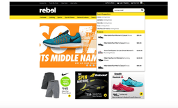
Below is a great example of search functionality bettering the user experience . Not only has Rebel given search functionality top and centre priority on the website, but as demonstrated, a search term such as running shoes give the user a number of autosuggest product types and brands.
A blog from kissmetrics shows that brands had imroved their conversion by 82%by simply improving their search functionality.
Don’t ask the user to register
Frustration with your website will set in when you ask for details just as someone is entering your site.
If it is a returning customer there is a good chance that they won’t remember their password, if it is new customer they may not want spend time filling out details.
There should always be the option of a guest checkout, or at least for returning customers the option for for an express check out once the email address is recognised.
Shopify founder, Christian Holst stated recently that 30% of users abandoned their cart when asked to register upfront.
The best timing to ask for an account is once the user has completed the purchase. Clever programing means you can set their email address as their user name and fill in the account information with their order details. The messaging must be around creating value for the customer, users are weary of being spammed for life.
Offer free shipping
Free shipping allows another reason for users to buy your product.
An E-tailing Group study uncovered that free shipping is #1 criteria for making a purchase (73% listed it as ‘critical’). On the other hand high shipping fees were rated as the main reason why consumers were not satisfied with their online shopping experience. The study further revealed that shipping costs are the main reason why some people prefer the physical store experience to online.
What is more important for eCommerce business owners is that users will spend more when they are offered free shipping. A Techcrunch study revealed that customers will spend up to 30% more when free shipping is offered, a great way to move the needle on your average basket size.
If you don’t want offer free shipping, at least make sure that you are offering a flat fee. Most importantly though, you need to communicate shipping fees upfront don’t surprise the user right at the end, it is sure to be a conversion killer.
Need to incorporate a sales section or offer
The Bizrate Insights Ratings Study (2015) mentioned that the number 1 reason for abandoning cart was that the users were saving the product to buy it later.
Of those…
- 59% would purchase with a 20% or less discount
- 25% would purchase with a 10% discount
- 20% say a notification of when the item goes on sale would help them purchase.
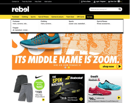
This insight could be interpreted in a number of ways, but in my opinion an online shopping experience needs to account for the bargain hunter. The Rebel website below has a dedicated section to sales.
Witchery also creates the feeling that their offer of ‘receiving the third item free’ is also too good not to be acted upon.
Loyalty programs are also a great way to get a value proposition across. Magento has a built in program as part of its offering but to get this program consistent with your brick and mortar store will require a bigger integration project and a lot more cost.
However you wish to portray value, make sure that your users know that your website is a treasure trove of opportunities.
Improve Speed:
Whether you have 100 sku’s or 1 million this should be your first checking point. A slow eCommerce site will lose you customers. There are a number of free tools that you can use to check the speed of your site, we like Google PageSpeed Insights , this checks and analyzes content of on your web page and suggests changes to make that page faster. Changes are based around web page performance, including resource caching, data upload and download size, and client-server round-trip times.
Remove distractions from your checkout page
A coupon field on a checkout page makes the user feel that they should be investigating whether or not they should be getting a better deal. Often they will leave the site to google for a coupon code. This will probably lead to shopping cart abandonment.
There is a heap of others, but I think these seven are the biggest factors for not closing the sale.
Happy Christmas Selling!


